
I helped an investment bank streamline their highly-complex internal tools making sure it became user-centric and allowed employees from over 70 countries to efficiently complete their daily tasks.
To comply with my non-disclosure agreement I have omitted confidential information and the app’s functional details in this case study. All designs are reinterpretation of the originals.
Working in an investment bank is all about efficiency, accuracy and speed. It’s a very responsible role which involves making many smart decisions every single day. Each judgement requires a liaising with other employees associated with it as well as looking at the raw data. We found that their job was becoming increasingly difficult as key insights were buried in email chains or spread across three different applications.
This situation contributed to unhappy and inefficient employees which in turn lead to a loss of profit for the bank.
MAIN GOALS:
Design one application that gathers up all the data as well as employee comments surrounding it.
The data and the way that it is displayed should be based on the employee’s job type and team.
Transform complex data with visualizations so that insights and patterns can be established.
Track and prioritize all future, current and past tasks and notify the user about upcoming deadlines.
Easy access to reports and its history with the possibility to contact the person who made it.
Create new reports from the template and share them with other authorized employees so they can work collaboratively.

My role
I worked on the project twice with different roles each time.
The first time I was a part of small UX team based in the same building as our future users whilst our developer team were located in a different country. The initial research phase was already over so my first challenge was to understand the user’s needs through interview transcripts and my team’s knowledge. My main responsibilities included designing various components and features and producing documentation for developers. The shift in time difference and the language barrier required that my work was thorough and detailed. There needed to be no room for interpretation.
In May 2015 I was invited back to the project. This time the UX team was much bigger and we had the front-end developers in the room with us. We split into smaller sub-teams with one UX Designer, a UI Designer and a developer to work on different user journeys in parallel. I was responsible for gathering requirements from stakeholders, understanding the problem through user research, passing on this knowledge to the rest of the team, creating user journeys, wireframes, conducting user testing sessions and sign off meetings with stakeholders, finally supporting UI designers and front-end developers when creating designs and prototypes from mockups.
The challenge
Design a software for many different workflows
After a few user interviews it became clear that the only thing our users had in common was the company they worked for. Their goals, daily workflow and tasks were almost completely different. Tailoring for many different use cases would be tricky.
Steep learning curve and banking jargon
Before I even started my first wireframe I needed to acquire specific domain knowledge in the financial sector. It was impossible to create a sensible user workflow without understanding the rules behind the problem. When I joined the project I did not know that much (read: very little!) about the financial sector. It was a steep learning curve for me not least because there was a lot of jargon to learn. Usually avoiding jargon is a good practice in application design, but in this particular case it was important to use the language of the bankers. Translating the terms into plain English does not make sense when designing for domain experts.
Translating the terms into plain english does not make sens when designing for domain experts.
Access to the Users
Our audience were experienced, knowledgeable and all too aware that “time is money”. We could not consume it with hours of UX workshops. Every single minute with them was precious and we needed to take everything we could.
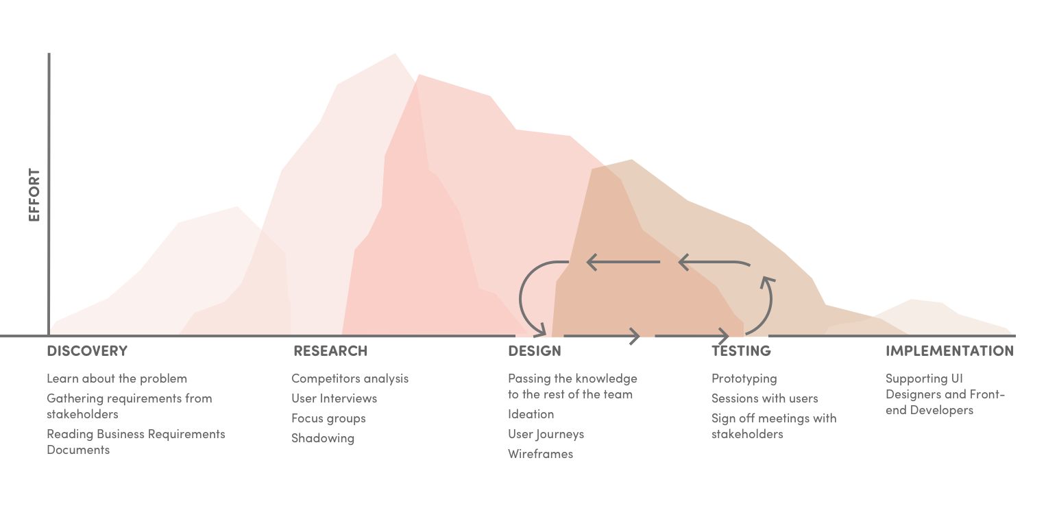
The UX process
As my role changed over time so too did the UX process adjusting to whatever resources were available at the time.
We always tried to begin with interactive sketching sessions with stakeholders, user interviews and - if it was possible - the shadowing method of observation. It allowed us to identify what tasks users perform in their jobs, how they do them, how long they take and what errors they make.
Those methods helped us gather business requirements, identify pain points and start with first ideas for the redesign.
For each department that we helped, we considered the following questions before we began:
Why had the previous process failed?
What data needed to be included?
What the ideal solution looked like?
How would it be used?
Would any other departments benefit from this proposed workflow?
How can we better visualise important data?
Can we reuse any of existing components?
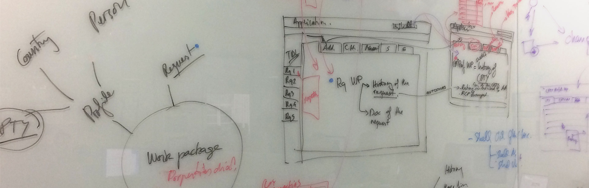
After the research phase, our UX team would brainstorm a range of design solutions by drawing quick sketches to test them amongst ourselves.
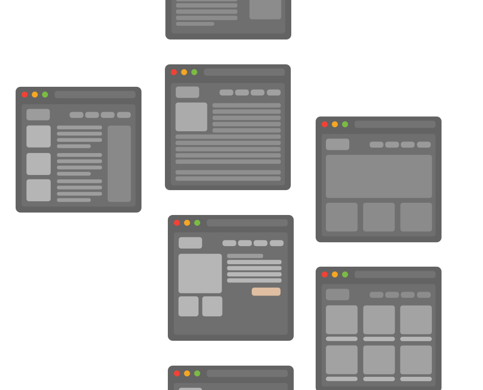
Early on in the project we found out that the traditional, grayscale wireframes were not easy to understand for our stakeholders. We spent a lot of our time on explaining that the future app is not going to be black and white. Because of this we decided to share design files between the UI and UX teams and instead present high-fidelity wireframes to the client. They also served as a basis for prototypes during the round of user testing.
We repeated the design and testing phases until both employees and stakeholders were happy with final user workflow.
Deliverables
Sometimes we were asked to create very detailed documentation with every user flow explained step-by-step and illustrated with high fidelity wireframes. It was especially needed when our developers were still based abroad. Later on we tended to translate our designs into interactive prototypes and short videos of guided user flow.
Template report library
We prepared a library of predefined templates to save time during repetitive tasks like annual or monthly reports. Teams could create new templates so that knowledge could easily be shared between different departments.
Context not raw data
We gave users a few simple features that would help understand the context of data in an otherwise overwhelming table. Users could further use this for easier access to other parts of the application.
Everything is under control
We designed history logs and a notification system to, firstly, take the burden of remembering from the user and, secondly, to allow them to easily investigate the source of issues–even in very stressful situations.
After many months of work we created an interactive and dynamic system that helps employees perform the same critical tasks with increased productivity. The software is now live and being used by most of the bank employees. We also produced a detailed style guide for the future internal design and development teams to continue to iterate on the software.
"Malwina stepped into the lead UX Designer role on this Investment Bank project and proved to be outstanding and more than capable of providing the best design solutions and handling client communications with ease. She would be an asset to any team."
- Ben Campbell, UX Team Engagement Team Lead